Well hello! I am posting this party early this evening because I hope to spend the night finishing up loose ends on my home show presentations and spending quality time with my boys. :)

I hope you had a great weekend! Since hubs was out of town, the Bubs and I were busy tearing up the house so my husband would come home and wonder what in the heck I was up to again working on the family room.
There is a major, serious thorn in my side when it comes our family room. You see, in the model, the fireplace was on the back wall, between two windows and the TV was in the corner. Somewhere along the line we both decided a corner fireplace would be super cool!! (Dripping with sarcasm.) So moving the fireplace then gave us the option to put the two windows together, which we did.
So that left exactly one five foot wall we could do anything with as far as the placement of the TV. FIVE FEET. Our TV cabinet fits in the space great, but the blasted subwoofer for our sound system is like three feet by four feet so it totally cramps that area. OK, it’s about 12 inches by 14 inches, but it has to go on the floor next to the cabinet, which makes everything tight. It has always really, really driven me nuts. Here’s an old pic that gives you an idea of how close the TV and cabinet were to the fireplace:

That doesn’t really do it justice – I mean, I was afraid they would burst into flames, they were so close to the fireplace. Really. I’ll have you know I even called our electronics store to see if they have any updated subwoofers (ours is six years old) that are smaller. Yes, they did! Yes, they are only ten by ten inches! And YES, they are only $700!!
OK, moving on. Dealing with the mongo speaker. So the other day, I decided to ignore the speaker and center the cabinet on the wall. The mongo speaker would just have to jut out the other way a bit. Fine!:

(Yes, I love Y&R. Sue me. Can you even believe Adam? And can you believe the woman who plays Ashley is 50-something? OMG!)
I decided a while ago that hanging the TV may help the cramped feeling of this area. A friend of ours told me how to hide the wires (yessssss) so I went for it. I got the right sized TV mount for only $50 at Target and it was surprisingly easy to hang. Just hang the mount into the stud, using a socket wrench (Dad is that what this kind is called?):

Easy! Next step is to take it down and hang it again because you forgot to put the washers on the screws. Next step after that is to take it all down and hang it again because you hung it too low. Easy!!
Then you just attach the brackets to the back of the TV:


I placed mine where the cords came out of the TV, but it didn’t really matter where they were, as long as the hole was covered by the TV. Then I drilled another hole straight down the wall, put the cords down through the wall and reattached them to the TV. Then I hung the TV on the mount. It was so intimidating at first, but ended up being insanely easy to do.
(The next few pics are fuzzy because I took them at night, so bear with me.)
I looooved the TV hanging on the wall! It immediately felt like a breath of fresh air. But the TV cabinet was feeling so dark! It’s always been a dark hole of sorts. You couldn’t even see my lovely $3 Goodwill baskets! I decided to paint just the back of it so they would show up just a bit more:

Didn’t that work GREAT?

Uhhhh. Notsomuch. I realized the problem hasn’t been the dark cabinet, it’s been the doors on the cabinet. I love them, but you can’t see a darn thing inside. I mean, why have $3 Goodwill baskets if you can’t see them? And the picture frames look like they’re in jail. So I just took the doors and the hardware off!:

Getting there!
I wasn’t crazy with how the accessories were working out, so I moved some things around. I used an apothecary jar instead of the flowers and covered some styrofoam balls with jute for some additional filler:

Love them! They weren’t exactly fast to make – but good mindless project while watching TV. And they were free. Score!


I moved the baskets down below so they didn’t block the back quite so much:

(The back is painted the same Sisal color I used on the wainscoting squares from last week.)
I couldn’t be more pleased with the result!:

Well, maybe I’d be more pleased with a 10 x 10 speaker. But saving the $700 meant I only spent $50 on this entire project – and that was for the TV mount. We watched about eleventy billion videos this weekend because the Bub can now access his DVDs (in the baskets) so easily! Those doors were hard to open, even for me. :)
So this month’s before and after…drum roll please…


Love it! For those that are interested, the cabinet was a find at the Pier 1 outlet store about seven years ago. I found it on a lunch break and my girlfriend helped me drag it up the stairs of our old apartment. It was a long lunch break. ;) (Thanks Cheryl!!)
Can’t wait to see what you have worked on! Any project will do – we just need a before picture. Remember to copy and paste the url from your post into the linky, not your blog address. (I have to delete those!)
Have fun and let’s party!


 I was honored to once again be asked by
  Make sure you check out the entire article online for more
 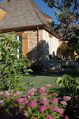 Earlier in the week I promised you a tour of a wonderful newly constructed house in Utah. Built by a reader of WD and her husband (who previously worked for Christopher Peacock Kitchens). The house is an wonderful example of true craftsmanship.
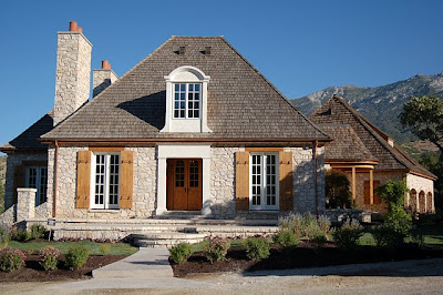 We were able to get a private sneak peak into this home which they refer to as the "French House". The home is currently for sale, and unfurnished.
 The main entry, though not grand in size is really beautiful. Notice the key details here: herringbone floors, hand forged iron railings, exquisite moulding details and a beamed ceiling. Beyond we see an interesting curved hallway.
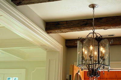 Here is a close up of the reclaimed hand hewn barn beams
 Of course when the builder is also a world class cabinet maker you know the kitchen will be the jewel of the home and this one is gorgeous! It has a very Christopher Peacock feel, but I think this particular kitchen has even more personality. I love the front X detailing on the center island. Also notice the coffered ceiling. I also like the choice of light fixtures!
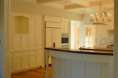 Notice the the first center island has a soft curve to it, which was harder to see in the picture above. Having a conversation at a curved island versus a straight one is much more enjoyable. You should always try to incorporate even a soft curve in a kitchen island if possible.
 I love the subtle diamond shaped marble tile backsplash. As expected the kitchen is outfitted with top of the line appliances.
 The first island has been thoughtfully designed with a step down so guests can't view a messy sink. The second island is topped walnut for food prep.
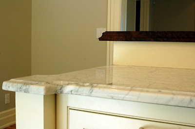 Here is a close up of the corner detailing on the island! Wonderful!
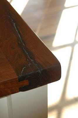 A close up of the walnut top - notice its tongue in groove and bread board sides.
 Coffered ceilings continue in the Living room, which also has a stunning fireplace and surround. Can you imagine how wonderful this home would look furnished?
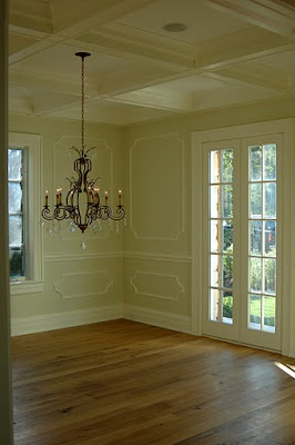 The dining room with French doors and interesting moulding details
 The family room continues the coffered ceilings. I love the fireplace! My imagination is going wild furnishing it in my head!
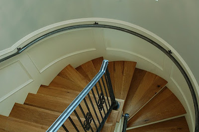 The curved staircase is just stunning - hand forged iron railings are beautiful.
 A quick peek into the master bath which reveals a coveted zinc soaking tub.
 This porch off the Master bedroom is one of several porches to take in the spectacular mountain views.
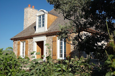
 Notice that the outdoor detailing and stonework are as elaborate and thoughtful as the indoor detailing. This shows just part of the back of the home. See the mountains on the right.
 Here is a side view - a lovely landscaped path - notice the copper gutters and cedar shake roof. More spectacular mountain views.
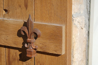
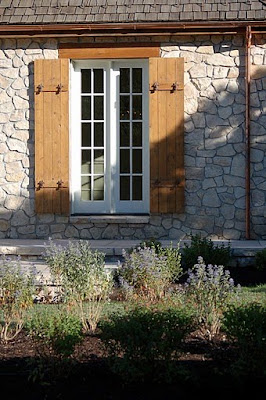 I adore the charm of these shutters!