Soane Ranger

We received some tear sheets in the office the other day from a English company called Soane that I immediately thought must be somehow associated with Sir John Soane but turns out is not, though it might be possible they were inspired by him. Soane was actually founded by Lulu Lytle and Christopher Hodsoll in response to the demand for architecturally inspired bespoke furniture and lighting. "Our aim is to combine the superb design and workmanship of the most exciting antique pieces, with the highest quality British craftsmanship and the flexibility of furniture made to your specific requirements."

Soane produces copies of exceptional 18th, 19th & 20th century originals, and their collection of furniture, lighting, door handles, glass and silverware also includes many new designs all made with the same meticulous attention to quality in Britain. I was especially delighted by the interiors on their website. Hope you enjoy them too. Cheers!


DMX controlled bookcase

Andrea tipped me on this bookcase (they look like billies) modified to have 96 channels of DMX controlling many tiny red, green, blue LEDs. Click to play the video. Impressive effect.


link

Update!
After posting this, Timothy, the creator of this LED bookcase contacted me with details of his hack. Click here for a downloadable pdf to make your own DMX controlled LED bookcase. Also see his other LED creations on youtube.

We're Not in Kansas Anymore

If I ever decide to move away from the hustle and bustle of New York, I'm moving to Kansas City! The city and it's residents are so gracious and warm that of course I had a wonderful weekend from the very first moment. I wish I traveled to the midwest more often because Midwest Airlines is hands down the best domestic airline. USAirways could learn a few things from them!

There was one small glitch. The hotel had no record of my reservation when I arrived and were also sold out for Friday night so David Jimenez, who I had plans with me that night, was a lifesaver and welcomed me into his beautiful home. I have to tell you that this was actually a good thing since he is the most wonderful host and his home is better than most 5-star hotels!

I can say with all sincerity that David is one of the nicest people I have ever met and also one of the most talented. His eye for design and detail is unmatched! I loved peeking into all the rooms and was blown away time and time again.

Above is the bedroom in which I slept like a baby! I was definitely taking notes for my design work!

The reason for my trip to Kansas City was to attend the Kansas City Home Design magazine Design Excellence Awards for which I was a judge. It was a tough task and there were a lot of entrants but one stood out among all the rest and that was the work of John Rufenacht Associates, above. I had no idea who that was at the time but I was very impressed by what I saw and learned. It was clear that this was someone with great design style.

John Rufenacht below, is a legendary designer in Kansas City and he was honored with the Edward Tanner Lifetime Achievement Award for Interior Design. The award is named after the noted architect, Edward Tanner, who designed most of the buildings of Country Club Plaza many of which have a Spanish style. My driver said that the legend is that it was because his mistress was from Seville and she was homesick and wanted to return to Spain so in order to prevent her from leaving, he designed the buildings to look like Seville.
John Rufenacht is not only a talented interior designer but is also the founder of Dining by Design. I think a lot of New Yorkers would be surprised to know that this wonderful event was begun in Kansas City more than fifteen years ago and has become the "signature event for DIFFA chapters nationwide." I very much enjoyed meeting Mr. Rufenacht and his partner, Richard Lara, who were both so lovely and gracious and I look forward to seeing what he does next!

After seeing the art that David Jimenez borrowed from Christopher Filley Antiques for his Dining by Design table this year, I knew it was the first place I wanted to visit. And thanks to my driver who had time before his next pick-up, it was! I almost cried when I got there though and it was closed so it was serendipitous timing that Christopher's partner, Rich, drove up at the same moment! I was very disappointed not to meet Christopher as well but he was recovering from a recent illness.

The shop alone is reason enough to plan a trip to KC! It is chock full of amazing art and artifacts and objects. They carry a large selection of African and Asian pieces but it was the art that Rich was patient enough to show me. I picked out a lot of amazing works for the Bachelor Pad including some beautifully framed etchings and the Gloucester Harbor painting above by Lester Gillette that will be perfect in the bedroom. I could have spent all day poking around this amazing shop and if you ever find yourself in KC, run don't walk to Christopher Filley!

Next door, is Suzanne Cooper Antiques. Suzanne is a character and is wonderfully knowledgeable. She and her husband also live in England so many of her pieces are English like the amazing framed architectural plates above. If I hadn't already spent a boatload of money at Christopher's, I might have bought those too, although she doesn't ship so I would have no idea how I would have gotten them home!

I did buy some lovely silver spoons that I couldn't pass out. The funny thing is that there was another New Yorker in the shop who was there with her mother-in-law who lives in KC. Small world.

This cute little garden was across the street and I couldn't resist taking a photos. I was very disappointed that the art shop on the corner without a name wasn't open. They had a lot of beautiful works in the window.

Saturday night, I was treated to a dinner party at the amazingly beautiful home of Zim Loy, the editor of the wonderful interior design magazine, Kansas City Spaces. I first came into contact with Zim when I posted a photo of David Jimenez's bathroom on my blog. She put me into contact with David and the rest is history. The co-hostess of the evening was another friend of David's who I got to know through my blog, Merrily Jackson. Merrily writes an entertaining and etiquette column in Spaces and after reading all her back stories, I definitely think someone should give this woman a book deal! I think I'm going to see what I can do to help make that happen! Emily Post has nothing on Merrily! I wish I had taken more photos of Zim's warm and welcoming home, shown above and below! It really was to die for! And the next time I have to choose paint colors, I'm calling her first!

The rest of the guests were no slouches either! It was a talented mix of creative people including Patricia Shackelford, who is an interior designer and blogger otherwise known as Mrs. Blandings. It was so fun to finally meet her in person and Maison21 is so jealous! (Ha!) Dan Nilson, owner of Bishop McCann, a global meeting and incentive travel/events company based in Kansas City, was sweet enough to pick up the non-driving New Yorker and ferry her to the party! (Thanks Dan!). Doug Wells, an interior designer who's firm, Kyle Wells Design, designed a Buenes Aires pied-a-terre that is featured in the June/July 2008 issue of Spaces. I also enjoyed chatting with Leslie Goldhahn, who used to live in NYC, and her boyfriend, Darren Mark. Leslie is in school at the moment studying interior design and I can already tell she'll make a great one! More people showed up for dessert, more on that later, who's names escape me at the moment but I hope will all keep in touch and look me up the next time they are in NYC!

Again, I cannot tell you how fabulous Kansas City and it's residents are! I enjoyed my trip immensely and thanks again to Kansas City Home Design magazine for making it all happen!

Weekend Project #2: Go fly kite!

Summers are for picnics and fun in the sun. Wendy Cook of Mother Rising sends me this project for an Ikea kite (based on this one). Best thing is, you'll be putting old Ikea bags to good use.

Wendy's Ikea kite

Ikea kiteIkea kite
What you'll need:
  • 1 sheets of colored 8 1/2" x 11" construction paper
  • 1 8" bamboo skewer
  • 1 Ikea bag cut in a 1" wide spiral all around for the tail
  • 1/2"wide masking tape or scotch tape
  • 1 bit of baker's twine - 6 to 10 feet for a child or a roll of kite string for an adult
  • a twig to wind the string upon
Tools:
  • Scissors
  • Hole punch
Here's how:
  1. Fold a sheet of 8 1/2" x 11" paper in half to make a 8 1/2" x 5 1/2" rectangle.
  2. Fold again in a diagonal 1/2" from the top folded edge, and 3" from the bottom folded edge.
  3. Fold back one side forming the kite shape. You won't need a stick here because the folded paper acts as a spine.
  4. Place skewer from point to point horizontally at the top of the kite and tape down securely.
  5. Cut the Ikea bag into a long spiral and tape to the base of the kite.
  6. Flip kite over onto its back and fold the front flap back and forth until it stands straight up.
  7. Punch a hole in the folded area approx. 1/3 down from the top point.
  8. Tie one end of the string to the hole and wind the other end around the twig.
  9. Let it soar!
See more of Wendy's Ikea kite on her blog.

Make a compact banquette from kitchen cabinets

Eugene does a fabulous job with this banquette, constructed from kitchen cabinets.

ikea banquette"I needed to build a kitchen banquette for my house, but the options for having one custom-built or buying modern benches was just too expensive." he says. "I then came up with an idea to use Ikea kitchen wall cabinets (Akurum) to use as the base/seating of the banquette. Using the cabinets served two purposes: (1) seating and (2) storage.
ikea banquette
ikea banquette
The seat cushions were custom made with vinyl by an upholsterer. I had to build wood supports behind the cabinets to give the seating area sufficient room away from the wall. I also attached small wood risers to the bottom of the cabinets to give sufficient clearance for opening the cabinet doors. The cabinets, risers, shims and cushions were all screwed to each other. The seat back cushions used Velcro for attachment to the wall. The table and light are from Ikea... the stools were from another store."
See other Ikea banquette hacks: 

Kansas City Here I Come!

I'm off to Kansas City this weekend to attend the Kansas City Home Design magazine Design Excellence Awards Ceremony. The magazine asked me to be a judge and I can say that it was hard work! There were a lot of great candidates so I can't wait to see who wins. You can also check out my latest story about all the great shops on Lexington Avenue in the July/August issue of KCHD and online here. Bon Weekend!

Photo by koreana on Flickr

Good looking Gronos

The Grono lamp is definitely a hacker favourite. Its smooth rectangle shape opens it to lots of possibilities. Here are a few.

Decoupage a Grono
Ingalill spent half an hour pimping this lamp. She found the picture and printed it, découpage it on and finished with a coat of varnish.

Grono lamp shade
Have a Grono pARTy
Jen of Painted Fish Studio threw a pARTy, where her friends gather at her house and make an art/craft project. The object in the limelight was the Grono and at the end of the evening, out came a delightful array of Grono lamps, pimped to perfection.

Grono lamp shadeGrono lamp shadePaper is used as the main decorative element, stuck onto the lamp with gel matte mediumgel matte medium - which takes longer to dry but more forgiving when it comes to placement than glue.

Grono lamp shadeLovely aren't they? See pics of other Grono lamps.

Knitted Grono lamp shades
Michaela finds the Grono lamp too frugal. "It craved for an overlay. The milky background is just the right stage for a knitted lace cover in alpaca-silk-yarn," she says.

Grono lamp shadeGrono lamp shade
See other Grono hacks:
> Palm leaf textured Grono lamp shade
> Grono as hanging bathroom lights
> Hand painted Grono lamp
> More Grono hacks including one with moo minicards

Get creative with lighting!

I'm back among the living! Yay! Thanks for being patient with me. :)

Anyway, I find an often overlooked aspect of decorating is how we use lighting. This includes lamps and general light fixtures, but I'm talking more of accent lighting. I have a few favorites that are cheap and easy to install.

The first is dimmer switches. OH, they are a must! First of all, they save energy. I have never, in more than four years, had to change a light bulb in a fixture with a dimmer. But the best part of dimmers is the how you can change the mood of the room with the lighting. I hate bright lights, so I am in love with dimmers. And they are so, so, SO easy to install. You'll need to turn off the light at the fuse box. (VERY important!!!) Then unscrew the wall plate, remove the old switch, match the smooth wire to the smooth wire, the bumpy one to the bumpy wire, and screw in the ground wire. It is actually easier to do than it sounds. (I'm not lying -- try it!)

This is a typical dimmer switch:


You can get them at Lowes, Home Depot, etc. The most basic versions are what I use and are only $7 each! They get fancier and more expensive, but you really don't need the extras. I love them in the kitchen, the bedroom, and especially the master bathroom. A dimmer is a MUST on cold, winter mornings when it's still dark outside and you want to wake up slowly!

Another favorite lighting trick of mine is using rope lights. These can be used inside and out, and I because they're not particularly pretty, I suggest using them above cabinets and furniture or inside furniture. These are fun because they are flexible, easy to move to the shape you need and don't burn hot -- you can put them virtually anywhere. I use them above our kitchen cabinets and also tucked into the top of furniture. Plug them into an outlet that operates with a switch, and it makes them especially easy to use.
Rope lights come in a ton of colors, but for inside, I recommend clear or white:


They even come with little plastic hooks you can use to hold them into place. Rope lights come in a variety of lengths -- two feet, four feet, up to 20+ feet. The longer versions can get expensive, but the shorter lengths will run about $10 or less.

Finally, you can create mood lighting anywhere in your home with simple accent lights:


I have used them in corners, behind furniture, in potted plants (they make them specifically for plants). They are great for highlighting art, or just adding subtle mood lighting around your home. These tend to burn hotter than the others I've mentioned, so just be sure to check them and make sure they are not near anything that could catch fire. Accent lights like this one usually cost less than $10 each.
So run to Lowes, check some of these out and try them yourself! I dare you to install a dimmer and tell me it wasn't easy! (Just PLEASE make sure you turn off the switch at the fuse box!!) :)

The Butler's Pantry

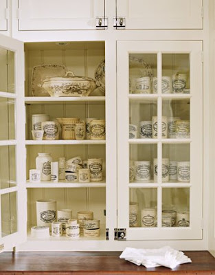
Who doesn't love the look of a traditional Butler's Pantry? The Butler's Pantry is making a comeback in American and English homes as part of a resurgence of nesting and homekeeping since the late 1990s. It is one of the most requested features in American homes today, despite larger kitchen sizes than ever before. There is a charm and nostalgia to the pantry, as well as a practical, utilitarian purpose.

Here are some pictures of my favorites:
House Beautiful
This lovely pantry is in Washington, DC. I adore the way the upper cabinets sit directly on the marble countertop. I love the use of the traditional marble and bin pulls with the contemporary chandelier.

House Beautiful
In America, pantries evolved from Early American "butteries", built in a cold north corner of a Colonial home, more commonly referred to and spelled as "butt'ry", into a variety of pantries in self-sufficient farmsteads. Butler's pantries, or china pantries, were built between the dining room and kitchen of a middle class English or American home, especially in the latter part of the 19th into the early 20th centuries.

The pantry above has drawer fronts which conceal cabinets and appliances. The designer liked the sleek look of all drawers so he had false drawers made to give the pantry an old world feel. Notice also the use of different "period tiles" including hexagon on the floor and subway tiles on the walls. All this topped off with beadboard, veined soapstone and upper sliding cabinet doors.

Here are some other examples:

MLS
This is a bit too formal for my taste, but I included it because I think it is interesting to note the wonderful use of lighting in this space. Notice the under cabinet and inside cabinet lighting; the chandelier, sconces and recessed ceiling lights. Very good lighting design that gives this pantry a special jewel box feeling.
House Beautiful
I love the use of latches versus knobs or pulls and the mahogany top.

House Beautiful
MLS
Again, the use of subway tiles, beadboard , glass doors - are you starting to see a trend?

I live in a classic 1930's Royal Barry Wills Colonial. I have a 7 foot by 8 foot butler's pantry that I am renovating back to its original splendor over the summer. I have had the help of a very talented cabinet maker that shares my vision. Together we have created a very special space. Now you have seen my inspiration photos. Gorgeous cabinetry, latches, bin pulls, glass doors and marble. I am so excited to see it come to fruition. I will share my pictures when it is complete!

Check out this stream