Isabell's Beautiful Gustavian Chair

I get the most wonderful emails from people all over the world about Willow Decor. One of the most recent was from Isabell in Norway, (but moving to Sweden). Please read her wonderful note and photograph, which she has allowed me to share with all you.


Hello ”Willlow Decor” !

My name is Isabell, a frequent reader of your lovely blog and I wanted to thank you, because by you I came in contact with lovely Kymberley Fraser. A while ago you made a post about her, and you showed pictures of some of 3 Fine Grains sacks. I have this great passion about sacks, so seeing them made my heart jump….. I contacted her and bought the one you see, which now is on my Gustavian chair…..the furniture upholsterer in Stockholm thought the old chair and the sack made a good marriage. So do we……………..

Your last post was wonderful, the furniture you have is really pieces to love. So beautifully done, and so nice they look in your home. Of course the cushions from Kym , just love the as well………….

Isn`t it fantastic how mutual interest have no boundaries, no borders, by your post I read, I came in contact with Kymberley, she sent me the sack to Scandinavia, (Norway), I sent the sack to Sweden, and now I am about to move back to Sweden living and loving among many other things our chair………the world seem smaller in a way……………………

Once again thank you !

Kind regards

Isabell

The reach and power of the Internet continues to amaze me. I am so grateful to be able to find so many other lovers of fine antiques and home decor world wide. I know you will agree that Isabell's Gustavian Chair is exquisite! Fabulous job, Isabell and thank you so much for sharing!

Let the Halloween crafting commence!

**I'm answering your questions about painting ceilings to my FAQ post -- you can find it on the right sidebar from now on!**

Can you even believe tomorrow is October 1st?? I can't. I wanted fall to get here so badly, and here it is -- temps in the 60's, a trip to the pumpkin patch scheduled for this weekend, planning Christmas decorations...errr, um, Halloween decorations. Uh huh.

I can't get enough of the fun Halloween scrapbook papers and sparkly stickers I see everywhere. I grab them up more often than I should, with the plan to make something with all of 'em. Adorable.

Tonight I did a quick project that turned out pretty cauuute and wanted to share it with you in honor of the start of the bewitching month. ;) I started with a scrap piece of wood from the garage and some fun paper. I used my spray adhesive to glue the paper to the wood, then cut around it with the x-acto knife:
I cut out some solid paper with my $1.99 scalloped scissors from Hob Lob and glued it on too:
(Sorry for the awful picture!) Ha! You can see the shadow of my hands taking the picture! Looks like a ghost. :)

Then the fun starts...I used a circle puncher to make a "moon," then added some of my cutey sparkly bats:
Then added some foam letters:
And used my new Martha Stewart glitter/glue to glam them up:
Can I tell you something? I'm not loving the Martha glitter. I thought I would love it -- I should because I spent a pretty penny on it! It just doesn't hold as well as my regular, cheapy glitter. I'm actually going to have to go over these again because the glitter just didn't stay on. Bummer!!

I added a few more foamy/sticker stuff and hung it with an orange ribbon:
For now it hangs in the laundry room, but I added felt pads to the back and may just hang it from a door knob somewhere.
It is so dang cute I just can't even stand it. :) More to come!

You Go Grant!

Earlier this year, interior designer and blogger Grant K. Gibson was beyond excited to have his apartment shot for the April issue Domino magazine. Then, he was beyond devastated to learn that it would never be published when the magazine closed. So I am happy to announce that you can finally see his wonderful home in the New York Times! The best part that much of it was done on a budget not that you could ever tell! I especially love the bedroom which reminds me of a masculine version of Lanvin's blue bedroom. You go Grant! I'm so happy for you!

Lanvin: Part Deux

No trip to Paris would be complete without a trip to Lanvin. We are lucky in New York that Barneys and Kirna Zabete carry some pieces of clothing and jewelry but that's nothing like having entire store full of nothing but Lanvin! It was heaven!

Lanvin is known for their creative window displays and we were treated to the new autumn displays that feature mischievous black cats. They happen to correspond to the new print ads and also harken back to the old advertisements for My Sin perfume that also featured a black cat.

This window with the cat sticking out of the handbag was my favorite!

The September 2009 issue of British Vogue just ran an interview with the designer of Lanvin Elber Albaz. In it he states that "the people I chose to run the store are nice. I cannot work with bitches." I can attest that the salespeople couldn't have been nicer or more welcoming and not just to the celebrities. Photographer Gilles Bensimon and girlfriend Diana Picasso (daughter of Picasso!) in the store when were shopping.

I wish I could have taken photos of the interior but I didn't want to push my luck so you have to settle for just the store windows!

Everyone keeps asking me what I bought in Paris so here you go. Before I even left, I knew that I wanted to treat myself to something special and definitely something that I couldn't get in New York. I saw a pretty bracelet in Roger Vivier but the exchange rate made it much too expensive. Lucky for me, we stopped at Lanvin right after where I did find myself a little something.

This Lanvin Happy Sac couldn't be better named because it makes me happy every time I see it and it was definitely something I would have bought myself in a heartbeat but it too was much too expensive to even consider. Although, I did see it in Barneys and might have to make it mine at some point. It's so me!

Instead, I settled on a set of bracelets. They are in a taupe/blush color that perfectly compliment my Phillip Lim necklace. I wore them out to a few fashion parties when I returned and they were a big hit. Even Stefan fell in love with the men's store across the street as did my friend's husband when they were in Paris this summer so it's not just for the ladies! I wish Lanvin would open a store in New York but until they do, it just gives me one more reason to plan another trip to Paris!

Grono lamp that's a tune

Another lamp to brighten your day. This one is from Tom. Aah ... reminds me of my old mix tapes.

"I saw this on Gizmodo and thought 'I can do that! It turns out the Grono table lamp is exactly on cassette tape width wide. All you do is lay out a 4x4 grid of tapes (missing one for the cable to come out) and tape them together with clear sticky tape. Then just fold it around your Grono lamp and you're done."

cassette tape lamp

Rimfrost table lamp

Iris makes a big bold light for her room by mating 2 Ikea lamps together.

"As a renter, I find it difficult to hang ceiling lamps in an attractive way without either permanent damage or cords everywhere. And so, I hacked together an Ikea Rimfrost ceiling chandelier shade, with another Ikea lamp shade, and an Ikea Januari lamp base to turn the ceiling lamp into a table lamp. The only additional materials the hack required was a bit of wire, to combine the two shades together. My step-by-step photos are here. But it's essentially a really simple hack."


The fifth wall. (And another dining room reveal!)

OK peeps. I've been wanting to talk about this topic for awhile. It's something very few do, but it makes a HUGE impact in a room. (In my little bitty opinion.)

The decorating element I love to add to a room is one most people never think of doing -- painting your ceiling. Not another coat of white -- a color. EGADS! Yes, I said it! Color on your ceiling! Ahhh, I've gone and lost my mind, right?

It is by far the one addition that I think makes a HUGE difference in the way a room feels, and it costs $20 for a gallon of paint.

The owner of the decorating firm I worked with turned me onto this, and I was SUCH a nonbeliever at first. I was hooked after our first painted ceiling though. I mean, head over heels in love, hooked. There are some "rules" that you may want to follow that I don't, and I'll tell you those in a bit. Also, there are some myths about painting a ceiling I'll address too.

I had the ceiling in our family room/kitchen combo painted the same color as the walls and absolutely love it:
Reason number one I love painted ceilings -- if you have crown molding, it will make them absolutely pop off the walls when your ceilings are painted. When you have crown and a white ceiling, at least the upper half of it washes away, and for all that work and money, you should SEE it. ;)

I am chomping at the bit to get the crown installed in these rooms, because I know it will look ahhhhmazing against the Sisal colored walls and ceiling. ;)

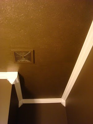
In our chocolate colored powder room, I painted the ceiling the same color as the walls, and look how the molding pops!:
I added a thin coat of my glaze over the paint, just to give it a little bit of fun. (I think you can do whatever the heck you want and get dramatic in three rooms -- laundry rooms, powder rooms and dining rooms.)

In our son's bathroom I did the same blue as the ceiling in his room:
I didn't go the same color as the walls in these rooms because I wanted to tie in the blue that was used throughout, I wanted it to give the look of a sky, and it was just plain cute:
We don't have overhead lighting in our den (pounds head on table for that), so it's the darkest room in our house. I went with the same color of the walls to keep the cozy feeling we had going:
And I. love. it. (I'm going to install crown in here too, forgive my horrible cutting in...)

There is a common thought that painted ceilings make the room darker -- this is only true if the room is small, has low ceilings has little lighting. If I did a dark color on the ceiling in our master bathroom, with tall walls and tons of natural light, I can promise you it would not be darker in there. Swear. Bet you one meeellion bucks.

Another thought is that it make the room seem smaller. Even a small room like our den didn't shrink -- I swear it got bigger. When you remove the white ceiling, the eye just keeps going...it doesn't stop. I make the room seem more expanse and taller...YES, taller. When the ceiling is white, it stops your eye and shows exact height of your ceilings.

My first attempt at a painted ceiling was years ago. I wanted to give the illusion (there I go with illuuuuusions again!) of a tray ceiling in our dining room, so I put up molding, and took a color out of the light fixture for the inside of the molding:
I added a glaze to the top to make it glitter just a bit, and at first we loved it. It has stayed like this for years, but with the recent dining room redo, it just wasn't working anymore. I had the ceiling painted a couple weeks ago (I splurged and called my "guy" I use for ceilings when I'm feeling lazy) and had him leave the color on the inside, thinking it would look cool: Ummmm, it didn't. It looked like baby puke.
So in about an hour and a half, I finished it up and continued the chocolate brown:
And I adore it. (Oh yeah, I'm waiting on a special little somethin' for that empty area to the right of the table...patiently...waiting...)

The light, I have always loved...

But now I'm craving something more traditional...is that wrong? I spent a pretty penny on this light. I can't believe I'm considering this. Yikes. I have a spot where I may be able to put it, but I'm not sure what I'll do. Thoughts?

There are general guidelines "they" say to use when painting a ceiling. The first is, if your ceilings are eight feet or lower, go half and half with the color -- like half white, half wall color. Or at least take the wall color lighter a few shades. Also, if you are painting ceilings in small rooms, the general thought is to go lighter.

If your ceilings are nine foot and taller, you can go the same color as the walls. If they are VERY tall, I'm talking like 15-20 feet -- you can darker than the walls. This is for instances when you want to make such a tall space cozier and not as cavernous feeling. And it works!

My rules are...do whatever the heck you want! I almost always do the same exact color that's on the walls, no matter the size of the room or ceiling height. You can do a different color, you can go lighter, darker, whateva. I highly recommend flat paint though. Any other finish will be too shiny. If you want some shiny, use a glaze like I did to glam it up...but do it sparingly.

Painted ceilings are not for everyone. And you will be sceered, verrrry screered the first time you do it. (Heck, the fifth time you do it!) But I have yet to regret one of them in our home.

Next up...I'll show you my cheap-o hutch redo!

P.S. I believe I said "ceiling" 267 times. 268.
P.S.S. I am finishing up answering your questions on my Q and A post tonight! That was FUN!

Jeanne Lanvin's Apartment in Paris

One of my favorite things from Paris was viewing the reconstructed apartment of fashion designer Jeanne Lanvin at the Musee des Arts Decoratifs. It consists of her boudoir, chambre de coucher and salle de bain that were designed for her by Armand Albert Rateau for her apartment at 16, rue Barbet-de-Jouy in Paris in . It's a little hard to see because it's protected by glass walls but it's beauty and wonderful details are worth making the trip. The blue of the bedroom is known as Lanvin Blue and is said to have been inspired by the blue sky in a Fra Angelico fresco seen by Jeanne Lanvin. Just another example of how art, fashion and interior design all converge to great effect!


Fernando Bengoechea's Photography Lives On

Last week, I was surprised to receive a message from Marcelo Bengoechea, the brother of the late photographer Fernado Bengoechea who was swept away by the tsunami of 2004. He is reviving his brother's art of weaving his photographs and is now offering them for sale for the first time since Fernando's death. I remember tearing out a page from a magazine many years ago that highlighted this unusual art form and thinking it was the most amazing and beautiful thing I had ever seen. It was a pleasure to hear more about the process from Marcelo and know that Fernando's photography will live on.

HC: Can you tell me how you decided to start this project?

MB: The revival is something totally new. I just could not let Fernando’s art share his tragic fate. He’s dead. I have no choice than to accept that. What I refuse is to accept the death of his beautiful work so I took it as a personal mission to revive it. As a designer myself, laid off a couple of months ago after 10 years as the Creative Director for the surf brand Reef, I realized that it is the perfect time to do something like this. I had been thinking about it for a couple of years and after a good conversation with Nate Berkus I just had to do it. The reception has been so positive that it keeps me motivated to continue the project. It is still too early to say if it is going to succeed or not (financially speaking) , but to tell you the truth, it doesn’t matter, it is a success to family and friends already.

HC: Do you feel that there is a sense of therapy to the work that you are doing?

MB: For sure there is some kind of therapy in the weaving process, but mostly I feel honored, loved and a sense of continuing our friendship and good times after his death. We had the kind of relationship where just by looking at each other we knew what we were thinking and most of the time those instances were during mischief or adventures. I know a lot of the stories behind the images and that brings me closer to them and to him. His death was my first close up experience with loosing somebody important in life and I do not think I’ll ever get over it. Weaving definitely helps.


HC: Do you do all the weaving yourself?

MB: At this point I am doing limited editions, hand weaving each one of them. I watched my brother weave those images and thought he was somehow insane, now I feel his energy pass through my hands as I weave and think this is crazy. Crazy in a good way, a proud way. Vivre.com just started offering them last week and it is the only place to find them for now other than through myself. One of this days I will have a new website and make them available there as well. I am following Fernando’s original concepts, including the framing style of his latest works (the Karma Trees series that was shown at Ralph Pucci Gallery), framing them in rich Peruvian Walnut and “floating” them the same way he did. I am even using a knitting needle as a weaving tool that once belonged to our grandma and he used to weave the smaller pieces. I am also adding my touch (please see Cabeza de Vaca I and II concept) to evolve and add some design as well.

"It is a collaboration between brothers. It just happens that one of them is dead. We were able to work together in several shoots for Reef that he shot and I directed and it is great to continue our team work this way. Since the beginning of our professional careers that was a goal of ours and I am proud to say that it is still going on." - Marcelo Bengoechea

Shaky no more Billy

Andrew adds some stability to the Billy bookcases.

"My wife and I just purchased 6 Billy bookcases to go in our dining room. Having read some people complain that they could be a bit wobbly, I did the following. When assembling, I put glue in all the dowel holes connecting the top/bottom/middle shelf to the case sides, and then when installing, I connected them together into 2 groups of 3 to make a rigid structure, that's attached to the wall."


See the process photos on Flickr.

Lekman cover up

Genna who is one of the Kitchen and Dining co-workers at Ikea Houston (hello to all you guys out there!) glams up the Lekman box. Nice touch.

"This one is pretty straight forward. I have an Expedit tv unit but needed closed storage. I didn't want to spend a lot and so the Lekman box was the best price. Although, the Lekman by itself is not the best looking thing. So, I took some spray adhesive and some wrapping paper from the Container Store and covered just the fronts. Hope you like them."


Check out this stream