Linda Banks' Iris Hill

Anyone who has picked up a decorating magazine has seen the work of interior designer, Linda Banks. Let's have a look at her home,
Iris Hill in Connecticut.
All photos from Banks Design Associates.

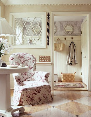
I love this space! From the painted floors to the antique barber shop pole. Don't underestimate the use of interior windows, they add the illusion of space and light. This window is wonderful.

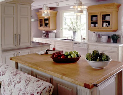
The kitchen is has such charm. I love the antique hanging cabinets and butcher block center island. Notice the antique towel bar on the end of the island.


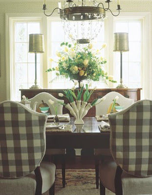
This is a lovely dining room. Notice the detailing on the chairs with coordinating upholstered checked backs. The lamps on the side board and beautiful chandelier complete the look!

Finally, the living room - what interesting detail on the walls. This is an inexpensive way to cover not so perfect walls and add unique detailing at the same time. If you are ever in Portland, Maine head to her store SIMPLY HOME -a great collection and worth the trip.

Map Quest

I was thinking about art for the Bachelor Pad make over I'm currently working on and one thing that I suggested was a vintage nautical chart from Cape Cod that shows the town where his family has a summer home. I showed it to him and he actually liked it which is good since it's very reasonably priced on eBay and we don't have much money to go crazy.

Conveniently enough, I thought it would also make a good blog topic since a lot of other people also decorate using vintage and new maps in a myriad of creative ways. The vintage nautical chart of Long Island (above) hangs in the Sag Harbor home of Margot Brunelle Fooshee, who is head of marketing for the J. Crew clothing company, and her husband. The house which was published in House Beautiful last summer previously belonged to Steven Gambrel and Ruthie Sommers designed it for the couple. Can you imagine?! What a lucky little house!

T. Keller Donovan took the map idea one step further and displayed them en mass on the wall of his Miami home that was also published in House Beautiful. He actually found the 1943 Miami Beach plat maps at Paula Rubenstein in New York which is pretty funny.

Kerry Joyce wallpapered the bedroom wall in a maps to create a beautiful and serene backdrop. I love the colors of nautical charts since they are almost always made up of pale aqua and tan colors which are my favorites.

Just published in the June/July issue of Domino is the Nantucket cottage of photographer extraordinaire, Matt Albiani, who also wallpapered a bedroom in nautical charts that faded over the years. Matt is actually very close friends with a girl who used to be my roommate in Boston. It's a very small world. I've met him a few times and he is as nice as he is talented. You can also see his New York apartment in the issue and online in a video house tour.

This bedroom looks like it was papered using new maps including a few from Paris. Kate's Paperie in New York has maps printed on sheets of paper that would be perfect for this option.

Last but not least is the bathroom decoupaged in marine blueprints in the Maine house of Gwen McGaw that was designed by Windsor Smith and published in the premier issue of Vogue Living in 2006. Very creative and original!

The possibilities of decorating with maps seems endless and also a perfect DIY project for summer! I was also thinking that maybe we should all start buying up maps now before they vanish due to GPS and internet! Just don't bid on any of Cape Cod! The auction hasn't ended yet for the one I need!

double up your work space

dan and erin needed to fill their guest room / office with some thing that...
1) wasn't expensive and
2) looked good

so with a tape measure in hand, they spent 4 hours at the college park, maryland ikea and left with 2 vika amon 4' 11" table tops, 4 vika curry legs, 1 malm 2-drawer chest, and 1 set of 6" capita legs.

and here's what they constructed.
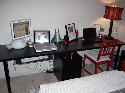
computer desk"we put the two vika table tops end to end, and installed the vika curry legs at the furthest opposite ends. two capita 6" legs split the middle seam, and sit on top of the malm chest. the chest supports the seam at the middle, and creates a storage space underneath.

computer deskcomputer deski also installed the summera pull-out keyboard tray, but the vika tops are so hollow that it's already starting to strip out. in all, we spent $120, and the desk really has helped our new office/guest room.

we plan on finishing off the room with a 5' vika amon table top used as a headboard, and hanging the lack shelves above the desk area horizontally for more mementos and storage."

Updated! February 25, 2009
Reinforced double table
Beth was looking for an idea on how to enlarge her current desk without spending too much and gave her better access to her file drawer when she came across the hack above. But after reading the comments, was worried about having enough support along the seam. This is her solution.


She says, "My solution was to add 2 cheap legs to support the back, and screw the Capita legs into a 3/4" thick slab of plywood. This gave a lot of support to the desktop, and the plywood thickness made up the difference between the end of the leg and the desktop (legs were 12" long at the fully adjusted length and I had more space than that, but the next size up would've been too long). I then ironed on some edge banding to cover the front of the plywood slab to finish it off!

Products used:
- 2 Capita 4" legs
- 2 Vika Amon desk tops
- 1 Erik Drawer unit
- 4 Vika Fintorp 70cm legs
- 2 Vika Curry Silver legs


Materials Needed:
- 1 12x16" plywood slab (3/4" thickness)
- 1 roll Black/Brown edge banding (bought from Home Depot for Mills Pride Cabinets)
- screws
In Memoriam: Yves Saint Laurent 1936-2008

When I was little, I always wanted to be a fashion designer. I used to sketch clothes and I poured over a book of designs by Yves Saint Laurent while lamenting the fact that I was too young to wear his fabulous creations or hang out at Studio 54. So I was deeply saddened to learn of his passing yesterday. As most creative types are wont to be, Yves suffered from addictions and depression but still managed to create some of the most iconic clothing of all times. We have him to thank for the safari look, the tuxedo for women, and some of the most beautiful dresses ever created.

If you want to learn more about this talented man, I suggest you read Before the Fall: Lagerfeld, Saint Laurent and Glorious Excess in 1970's Paris by Alicia Drake and watch the haunting documentary, Yves Saint Laurent: His Life and Times, 5 Avenue Marceau 75116 Paris by David Teboul. Au revoir Yves!


In 1967, Yves Saint Laurent created the costumes for Catherine Deneuve for the film "Belle du Jour" and the two became lifelong friends.

Yves Saint Laurent with two fashion models who went on to become muses, Betty Calroux (left) and Loulou de la Falaise, outside his 'Rive Gauche' shop in 1969 wearing the famous safari look.

Yves was very influenced by art as seen here in his Mondrian dress from 1965.

Bianca Perez Morena de Macias married Mick Jagger while wearing a risqué Yves Saint Laurent white suit at the town hall in the French Mediterranean town of St Tropez in 1971.

"Fashion fades. Style is eternal." Yves Saint Laurent

ikeahacker is ...

TWO!

woohoo! roll out the swedish meatballs.

thank you, thank you, thank you for sticking around and supporting the site. seriously. your hacks, comments and emails have kept me going. please do forgive me if i have been slow in replying your mails or posting your hacks. the last few months have been challenging for me as i finally said goodbye to life in the agency.

it is a dream come true to be able to work from home. and this site has partly given me the freedom to blog and freelance full time. while the dream is sweet, living it out is another thing altogether. i am an absolute newbie at freelancing and it has been a steep walk up the learning curve these last 3 months.

but i am not complaining - nothing beats waking up and strolling 5 steps to my 'office'. i do plan to start a new blog. it will be very different from ikeahacker and a lot of more personal, as i take stock of the lessons, trials and joys of working as a freelancer. hope to get it up by end july, if i don't get too lazy sitting around in my jammies watching tv.

but what i am really interested to know after 2 years of running this site is ... what do you think i can do to make ikeahacker better?

share your thoughts on one or all of the following:
> i think it would be great if i see more hacks on ...
> ikeahacker can help me hack better if ...
> this site will really rock if ...

click on the comment link and let me hear ya. all ideas welcome, fire away.

malm room divider

william does a great job with 2 malm chests as room dividers and storage space. am loving the back design.

"i wanted something wider that could also be used to separate living spaces. i screwed two malm 3-drawer chests together side by side, added some support so i could add elevator legs and make the chests appear to 'float' a bit off the floor. to tie it together visually i got a 1/2" piece of tempered glass that was painted white for the top.

the malm does not have an attractive back so i added a solid panel to it. i started with an organic design i made in adobe illustrator, and then had the design routed out of 3/4" mdf with a cnc router. after having it finished with a high gloss paint, it was simply attached on the inside of the 2 connected malm chests."

Opposites Attract

I thought it was funny to open the May 2008 issue of Town & Country magazine and see a spread about a couple that I have had the pleasure to meet in New York, Blair and Alistair Clarke. Blair is a fabulous dealer of contemporary art and Alistair is the worldwide head of English and European furniture for Sotheby's. Alistair was in charge of my old boss's sale at Sotheby's a few years ago and for some reason I always see him when I'm walking on the Upper East Side.

Anyway, I think their apartment is a great example of mixing modern art and antiques. Without Blair's contemporary pieces, Alistair's antiques would look very stuffy. They definitely lighten the mood and make for a very interesting space. "So many people are worried that they'll do something quote unquote wrong, " says Blair. "But Alistair and I think it's a great luxury to experiment with new ways of living with art."

Blair and her daughter Poppy pose in the entry gallery in front of paintings by Natasha Law, Jude's sister.

Alistair in front of another Natasha Law painting.


In the library, a Richard Serra oil stick drawing hangs over a Regence kingwood commode, circa 1730. I love the grasscloth wallpaper that adds some texture to the walls and adds another layer of interest. I realized recently that all my favorite interiors have layers made up of different tones, textures and surface materials. It gives your eye more to take in than a slick all white room.

In the dining room, the juxtaposition is quite evident as 18th-century decorative arts share space with a martini glass chandelier by Michael Marra, while an Andy Warhol Marilyn Monroe silkscreen looks on. While below, a Sara Genn painting and a Shane Bradford box lighten up the mood of Alistair's Boulle-front cabinet while Poppy plays in the background.

Photos by Oberto Gili

Check out this stream