Some designers don't even get a room in the
Kips Bay Decorator Show House but that doesn't mean that their spaces weren't any less spectacular. I wasn't familiar with interior designer
Christopher Corcoran before seeing his work on the landing of the second floor but now I am glad I have become acquainted with his lovely design sense and eye for detail.

I love the texture and pattern that the wood lattice creates behind the traditional entry table and chairs. It's also another example of a quiet and elegant design that works well in this show house.

The fourth floor landing was another favorite "room" and was designed by
Paula + Martha. Paula being Paula Caravelli and Martha being Martha Angus. I didn't get to meet them but from what I can gather on their website, they met while working for Naomi Leff and later decided to work together. I'm glad they did because their work is full of wonderful art and antiques. Their space is titled the Executive Director's Office and refers to Daniel Quintero, The Executive Director of the
Kips Bay Boys and Girls Club, hence all the photos of children!

One of best parts of attending the President's Preview was hearing Mr. Quintero speak about how important the show house is to the
Kips Bay Boys and Girls Club and all the children it helps through it's programs. He couldn't be a better spokesperson since he was a member of the club growing up! I would love it if anyone who's been enjoying my posts but lives too far to visit the Kips Bay Decorator Show House in person would consider making a small contribution to this wonderful organization! Every little bit helps!

We had a client at my last firm who asked for burlap curtains. I thought she was crazy and so did our drapery showroom. The fabric is so stiff that it doesn't hold a pleat very well but
Paula + Martha managed to make it look fabulous in their little room. I especially love how the orange trim keeps it from looking too drab. A few of the antiques including the desk were borrowed from the wonderful antiques dealer,
Gerald Bland, who is also selling Mr. Hadley's drawings.

Back up on the fifth floor, Janna Bullock was given the not so easy task of decorating the elevator landing but decided to think outside the box literally! I've known of Janna Bullock for a few years since she shared the same publicist as the designer I used to work for but I didn't know about her design work until recently. She is an international real estate developer from Russia who has always been involved with the interiors of her buildings and is also wonderful patron of the arts which is why her room was designed as a collector's retreat. The floating furniture/sculpture is by the Russian artist Anya Zholud while a Sam Taylor Wood photograph of a family in a home wraps around the walls. The photograph on the while walls makes the space look like an art gallery but the subject matter makes it look like a room in a house with the "furniture." I think it's a space that makes you think which I really appreciated!

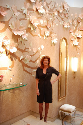
From this vantage point, you can see where the more modern upper floors meet the still grand lower floors. When I was upstairs, I thought the flowers on the wall looked like a French porcelain wall decoration but I would soon find out they were not!

The flowers are actually paper! Interior designer
Amy Lau partnered with
Maya Romanoff to create this stunning design. Amy Lau is very high energy and she told me that while she figured out her concept quickly while going through the Maya Romanoff wallpaper archives and then needed to find an artist who could create the flowers in a short time period. Lucky for her and the show house, acclaimed paper artist
Jo Lynn Alcorn was up to the task.

The background paper is Wall Mica from Maya Romanoff who created all the papers for the wall including a custom color for the branches and hand painted paper for the leaves. The whole effect which includes custom gilt mirrors is stunning and is perfect for spring!

The design really matches the architecture of the house and plays well off the brass and iron railings. The creativity and talent of everyone involved with the show house this year continues to amaze me!
 Christopher Maya
 was challenged with decorating the entry hall which is all cold stone which he tried to warm up with plumy colored ikat, velvet banquettes and a skirted center table. This area was a bit of a mess the day I was there so I don't have many good photos but there is a better one on
New York Social Diary. The designers of the public spaces were given a tough assignment but I think they all passed with flying colors!
 Some designers don't even get a room in the Kips Bay Decorator Show House but that doesn't mean that their spaces weren't any less spectacular. I wasn't familiar with interior designer Christopher Corcoran before seeing his work on the landing of the second floor but now I am glad I have become acquainted with his lovely design sense and eye for detail.
  The fourth floor landing was another favorite "room" and was designed by Paula + Martha. Paula being Paula Caravelli and Martha being Martha Angus. I didn't get to meet them but from what I can gather on their website, they met while working for Naomi Leff and later decided to work together. I'm glad they did because their work is full of wonderful art and antiques. Their space is titled the Executive Director's Office and refers to Daniel Quintero, The Executive Director of the Kips Bay Boys and Girls Club, hence all the photos of children!
  One of best parts of attending the President's Preview was hearing Mr. Quintero speak about how important the show house is to the Kips Bay Boys and Girls Club and all the children it helps through it's programs. He couldn't be a better spokesperson since he was a member of the club growing up! I would love it if anyone who's been enjoying my posts but lives too far to visit the Kips Bay Decorator Show House in person would consider making a small contribution to this wonderful organization! Every little bit helps!
 We had a client at my last firm who asked for burlap curtains. I thought she was crazy and so did our drapery showroom. The fabric is so stiff that it doesn't hold a pleat very well but Paula + Martha managed to make it look fabulous in their little room. I especially love how the orange trim keeps it from looking too drab. A few of the antiques including the desk were borrowed from the wonderful antiques dealer, Gerald Bland, who is also selling Mr. Hadley's drawings.


