It's always so interesting to me which topics resonate so strongly with readers - No upper cabinets in the kitchen is one I have received an incredible amount of email and comments about over the past few days. Readers, bloggers, designers and kitchen enthusiasts all have sent me their opinions and many have sent on photos.  This kitchen from Southern Living turned up both in my inbox and on the Gardenweb! Everyone agreed the windows were wonderful. This kitchen won high marks because of its size, it is so large the storage aspect would not be compromised.
 Another kitchen from Southern Living with a similar feel, though this kitchen had a mix of windowed walls and storage walls. Having both seems to be a popular trade off.
 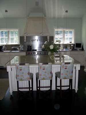 Linda Banks of Banks Design (one of my favorite designers) contacted me. She mentioned she wrote an article over 15 years ago in the now defunct, Decorating and Remodeling Magazine, shunning upper cabinets. She continues to limit their use in her kitchen designs. Here is a beautiful kitchen she did in CT.

 This kitchen from Southern Living turned up both in my inbox and on the Gardenweb! Everyone agreed the windows were wonderful. This kitchen won high marks because of its size, it is so large the storage aspect would not be compromised.
 Another kitchen from Southern Living with a similar feel, though this kitchen had a mix of windowed walls and storage walls. Having both seems to be a popular trade off.
  Linda Banks of Banks Design (one of my favorite designers) contacted me. She mentioned she wrote an article over 15 years ago in the now defunct, Decorating and Remodeling Magazine, shunning upper cabinets. She continues to limit their use in her kitchen designs. Here is a beautiful kitchen she did in CT.
Linda built free standing cupboards for extra storage. I love the mirrored fronts. To see posts of more of Linda's work click here.

This kitchen by Smallbone found its way to me via a reader in New Orleans. She thought I also might like the industrial stools. (which I do!) Notice the height of the ceilings in this kitchen - I think it adds to the drama.  Many of these kitchens highlighted different types of storage - Here we see a copper pot rack on the wall. This could easily free up a lower cabinet for dishes. This kitchen is from Plain English.
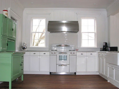 Many readers also mentioned that omitting the upper cabinets is easier when other types of storage are available. This kitchen from HGTV shows a Hoosier cupboard.
 Photos of European kitchens came my way - here is another one from Plain English. This is a favorite of mine, I love simplicity and warmth in this kitchen.
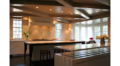 Another blogger directed me to architect Ruard Veltman who often sans upper cabinets. Isn't this kitchen fabulous?!
  Here is another angle of this great room! Notice the wonderful inset shelves on the left.
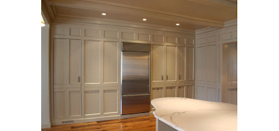 Most readers agreed that having a Butler's Pantry or large wall of cabinetry allowed the rest of the kitchen to be freed up to allow for windows. Veltman outdid himself with this striking wall of cabinetry.
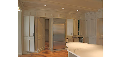 This wonderful paneled wall turns into a trove of hidden cabinets. Spectacular! To see more of Veltman's work here. To see more on Butler's Pantries click here.
 Many of these kitchens highlighted different types of storage - Here we see a copper pot rack on the wall. This could easily free up a lower cabinet for dishes. This kitchen is from Plain English.
 Many readers also mentioned that omitting the upper cabinets is easier when other types of storage are available. This kitchen from HGTV shows a Hoosier cupboard.
 Photos of European kitchens came my way - here is another one from Plain English. This is a favorite of mine, I love simplicity and warmth in this kitchen.
 Another blogger directed me to architect Ruard Veltman who often sans upper cabinets. Isn't this kitchen fabulous?!
  Here is another angle of this great room! Notice the wonderful inset shelves on the left.
 Most readers agreed that having a Butler's Pantry or large wall of cabinetry allowed the rest of the kitchen to be freed up to allow for windows. Veltman outdid himself with this striking wall of cabinetry.
 This wonderful paneled wall turns into a trove of hidden cabinets. Spectacular! To see more of Veltman's work here. To see more on Butler's Pantries click here.
.
Thank you all for commenting and sending on the photos. It seems the overall verdict was that people preferred the natural light. And if space allowed, they wanted to at least incorporate one wall of windows. Let's wait and see then, if this does in fact become a trend! 


