updates: the ikea living room event

serving some updates from the ikea site, so you can enjoy a spot of armchair shopping over the weekend.

the living room event is happening now till october 1st in stores. on the site, you can view an online living room catalogue. not much new stuff, just more of combining pieces that work together and showcasing them ikea style.

if you're looking for a sofa, you may also want to pick up a tip or two from their sofa guide. since the sofa could be your most dramatic (and expensive) investment for the living room, it's always good to do some homework.

while you're there - do check out the ikea planner tools for the kitchen, bathroom, home office, wardrobe and bathroom. i've never used them, preferring to scribble on scraps of paper than clicking buttons but if you're planning some thing more complicated, it might be worth downloading.

and if you're planning a really lazy weekend (like me!), you can even order in swedish goodies. ikea direct offers a number of breads, candies, coffee, cookies and preserves. just call 1-800-434-ikea to place your order. that's just sweet, ain't it?

it's been a long and exhausting work week for me. so i'm going to sign off now and snuggle in my sultan bed for the next 48 hours.

have a great weekend. returning next week, hopefully recharged, with more hacks.

ikea inspiration kicks off with monica's makeovers

this is one of the things i'm including more and more on ikeahacker. as much as i would like to feature only ikea hacks, some times i do come across homes, apartments and rooms that use ikea "as is" - gorgeous with no hacking, just clever decorating. it is such a pain to pass them by just because they don't fit the category. so, after thinking about it for like 3 minutes, i've decided to deny myself no more. hopefully, by sharing these homes, we can inspire each another to create cozy, livable spaces. and that can only be a good thing.

so, if you've never hacked ikea but have a home or space that uses ikea stuff beautifully, drop me a line at ikeahacker [at] gmail [dot] com. we'll love to sneak a peek.
_________________________________________

to kick off this "ikea inspiration" section, as promised, monica's makeovers.

kaleb's under the sea bedroom
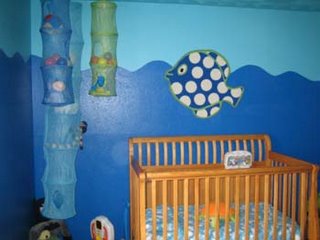
the first is her kid's room. she got rid of the zanzibar decor and gave the kid an undersea world instead, repainting the room and reusing some of their old toys and supplementing with some new ikea stuff.


monica writes: "i’m a firm believer in "do the best with what you’ve got", (plus, i’m a broke, stay-at-home mom) so we used furnishings we already had. we moved in a few things from another room and had The Great Toy Divide of 2006 (a divying up of toys between the rooms of our two kids.)


i had some items i had purchased new but never used and some items i purchased new, specifically for this room. all in all, our total cost was about $200! (if you’re wondering, that does include the cost of paint… we already had rollers, trays, and that sort of stuff.) kaleb’s reaction to his new space was priceless, and we were lucky to get it on video. the room has been redone for a week now, and he still gasps, points and smiles each time he enters it!"

go under the sea.

the green kitchen
now on to her kitchen, which is still a work in progress. but from what i can see, it's shaping along swell. funny, i never thought i could love green, but she's making me change my mind.

"my kitchen is in a state of what i call 'painfully gradual' remodel. i've been looking at dingy, off-white walls, funky old cabinets and 1970's linoleum for six years now.

my stay-at-home mom salary isn't cutting it (ha!) so replacing the expensive stuff is going to take a while. i finally decided to give the room a makeover and just change what i could. and what a change it made!


thanks to a weekend paint job and ikea goodness (some old, some new), i now have a fun place in which to grumble about funky old cabinets and 1970s linoleum."

to the green kitchen

besides running fixchicks with michelle, this talented mommy is also an artist. she has some funky artwork - my favourite is this ... er ... skeleton thingy (pix), for lack of a better word. how she manages to squidoo here, here and here and take care of 2 kids and paint and diy is beyond me. so, kudos to you, mon.

view and buy her artwork here. help monica to finally get rid of those awful 1970s linoleum.

related post:
> the fixchick's ikea hacks

the fixchick's ikea hacks

monica and michelle run fixchicks - the first online community for female diy’ers and the site's loads of fun. it features some pretty interesting finds like the cupcake carrier, which i doubt i'll see on a ... er ... "male" diy'er site. heh.

after seeing her ikea room makeovers, i wrote monica and asked if i could feature them, which i will, tomorrow. but first, some tasty appetizers. she sent me three to start, with the promise of more to come. right, monica?

they are pretty simple but i like them, because they do not need big-time sawing and drilling, yet makes an impact.

ikea hensvik dresser customization
she added cute hello kitty drawer pulls found from target to the hensvik dresser to fit the overall theme of her daughter's room. cheap and easy customization.


ikea stripa wall shelf as spice rack
ikea usually display their spice jars on the bekvam shelf but its not big enough to hold 10! so monica used the stripa wall shelf instead to display her collection, with room for 2 more.


portrait wall: ikea stripa shelves + raket photo frames

the raket frames are one of the cheapest things you can find in ikea and monica got a bunch on sale at 49 cents. "then, i sized digital photos in photoshop, converted them into b&w and punched up the contrast a bit ... printed them out on plain-jane-cheapie paper on my hp photosmart inkjet printer... cut to size, and whalla! i used 3 of the above-mentioned stripa shelves in white (like the one I used in aspen for my spice rack hack) to hold the framed photos."


i do like them lined up against the green wall. gives such a warm fuzzy feel, doesn't it?

for details on the hacks, go to monica's post on ikea hacks.

country quilt cover for klippan

it's refreshing to see a touch of country in this ikea hack, sent in by adline from malaysia. she used a patchwork quilt instead of the usual klippan slipcovers, with surprising results.

adline writes: "my second hand klippan came with a blue slipcover and unfortunately, i'm not the biggest fan of blue. as an alternative sofa covering, i used a queen sized quilt to protect the seating area. then, i cut a bomull bedspread in half and used the two pieces to cover the arm rests. the look certainly works for me."

admittedly country is not my thing, though i can see this hack working for me with some other textured/patterned fabric. my concern though is keeping the cover taut and in place. because i'm such a neat freak and can't live with the messed up sofa look. guess i could staple-gun the ends.

to view more of adline's klippan, click here.

related post:
> customized ikea sofa slipcovers

no lack of creativity in matt's media storage

matt's apartment was first a gem of a flickrfind on apartment therapy. i was immediately taken by the media unit - a lack shelving unit with sliding doors. wow! just what i always wanted. then, a commenter (thanks jamie pup!) suggested ikeahacker to him. and the rest, as they say, is a blog story.


despite its good looks, the hack is not complicated. just follow matt's instructions and you could have this beauty in your home too.

tools required:
  • drill
  • small screwdriver
  • hacksaw
  • ikea wrench to dis-assemble
parts required:
  • ikea lack shelving unit
  • two sticks of 1/4" aluminum U channel at least 70 3/4" long
  • small and shallow head screws tiny enough to fit into channel
  • two pieces of 1/8" acrylic or poly door material - matt's was bought and cut at tap plastics for under $40 - sized 36"wide x 9.5" high
"i took out all the lack uprights except the center one - which I had to re-drill the center piece and install about 3/8" back to accommodate the door rails. cut your aluminum rails to size, mine were 70.75", but make sure and measure yours.

pre-drill screw holes in the channel and lack. i had to drill bigger holes in the channel so the screws were slightly counter-sunk and the doors would slide over them alright.

i also used metal polish on the rails so they had a nice shine. finally, screw the channel in place except for one end... slide the doors in and all the way to the other side and you'll be able to screw the un-attached rail ends to the lack.

i chose a very cloudy (but still translucent) door and my remotes still work with them shut... not sure if a darker one would work as well, but might be fine."

if you can't get enough, click here to view a slide show on matt's apartment.
[via apartment therapy]

Updated! February 25, 2009
Scott does one too!
He says, "With a six-month old getting into things, we saw the writing on the wall and decided to upgrade our Lack bookshelf, which we'd been using as an entertainment center.  I had already sanded and stained it to a walnut finish, in keeping with our living room. Along with some baskets that hold toys below from Pier One, I used the hack you had up last year, and added sliding doors. Even in Manhattan, finding aluminum u-channel wasn't that hard - I did have to bring on the subway, though. The store lent me a hacksaw to cut into 2 pieces for transport. We used Tap Plastics for the doors, but had to order some samples before deciding on a color - this added about $20 to our total cost. This was much less than trying to find a new entertainment center, which would have been 3 to 5 times as much, I'm sure."

All in:
$99 Lack in 2003
$20 for samples (shipped)
$52 for door (shipped)
$10 for u-channel (cut)
$5 for stain (2006)
TOTAL: $186.00
(baskets were $60 from Pier One, though)


I think it came our really well. We use a RF remote, so the only problem was moving the center speaker on top. Much less clutter shows now and my wife likes is more than before!"

See more photos of Scott's media unit with sliding doors.

make your kid a chalkboard table

la apartment therapy recently featured a diy kid's chalkboard table which i thought was so practical yet so creative. i wished mom had thought of this while i was growing up. i would have gotten a lot less spanking from doodling on the wall.

anyways, my deprived childhood aside, with just a bucket of studio finishes chalkboard paint at $11.99 a bucket you can transform the ikea poang table into a kid artist friendly furniture. and since the poang comes in a set of 2, the van gogh wannabe's lil' sister can have her own canvas too. link.


effektiv on heels

i guess the ikea jerker desktop really does inspire hacks. ellen, proud owner of a jerker desktop, sent me her hack on the effektiv file cabinet, which accompanied her desktop.

she writes, "i wanted a file cabinet that was the same height as my jerker desktop rather than one that hid under the desk."

so she shod it in 8-inch capita pumps. then, not happy with the "officey" looks of the standard effektiv file cabinet handles, ellen replaced them with bitnik. a small change but i think they made quite a difference.

view more photos here.

related articles:
> the height adjustable jerker

wallpaper as wall art

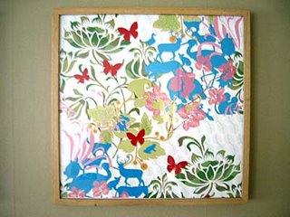
while we're on the subject of art, chrille sent me an idea for the perennial "what to frame" question. he combined ikea ribba frames with the animal flowers wallpaper posters by swedish designer hanna werning. lovely lovely.


check out hanna's site for more gorgeous wallpaper. here are two of my favs.


flower is coming back into power.


ikea art event

i've never been a big buyer of ikea art (for that matter, any art) but a quick search on their website shows that they have beefed up this section considerably. which may explain the ikea art event, begining september 20, 2006.

"at ikea we are no strangers to the great and the good of the world of art. we have been selling motifs of many artists such as picasso and monet. ikea art event adds a new dimension to our offer and opens the door for you, our customers, to the world of exclusive current galleries. the artists presented in the ikea art event are individual contemporary artists working in sweden. this is a limited edition. why limited? well, why not - this is an event afterall. here today, gone tomorrow. this is definitely an event you don't want to miss!"

and it's only for you folks in chicago, paramus, philadelphia and conshohocken. via positive fanatics.

now, what next?

thanks to aunt beep who wrote me on thisnext and gave ikeahacker a nice shout out here, i now have a thisnext badge. yeah, i'm a sucker for widget-y bling-blings (scroll down the page and you'll not miss it).

you'll find my ikea favourites (hopefully, from other designers too, once i can get my mouse off the ikea site) on the badge and more on my thisnext page.

if you have time this weekend, do check out thisnext. it's like an online show-and-tell. loads of cool stuff, recommended by regular guys like you and me. it beats going to the mall. really. but be warned, it may downsize your wallet considerably.

ikea hack of the month - august

work has been ultra crazy and i've been slack posting our regular hack of the month. but anyways, it is finally done. july's vote is closed with simon's cheap but chic stair lighting receiving the lion share of the votes. congrats, simon!

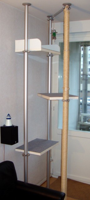
now, on to august. we featured 3 pet hacks, the cat pod, no pooper cat litter but my favourite is the stolmen cat gym. if i were a cat, i'd be purring in contentment.


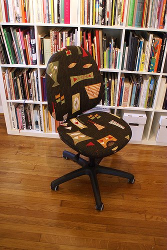
i also like claire's jazzed up chair and this simple (but probably not very lasting) post-it lamp shade. lastly, emily's gorgeous shoe storage, which earned her a mention in chicago apartment therapy. not many hacks get that honor. so what do you think? clicky clicky.


previous hack of the months:
> july
> june

jenni's west elm inspired box shelves

so, you've always wanted a box shelf like those sold at west elm but didn't want to fork out the moolah. jenni's hack might just do the trick for you then.


west elm's box shelves

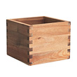
"a few years ago ikea sold these wooden planters. the planter came in plain wood with a silver square tray beneath to hold in water. dimensions of the box were 6"l x 5"d x 5"h. i took the planters, primed them, put wall stucco on them for texture, and added L brackets to the wall. slot the hollow of the boxes onto the brackets and voila! instant box shelves. i think the ikea planters retailed for about $2.00 or less. the ones at west elm are 3 for $44.00. easy hack. now if they still sold those wooden planters."


her box shelves dotting the wall


close up of jenni's version

the wooden planter jenni used is no longer in production but i think the bjuron will work as well, since you don't need the silver tray anyways. the dimensions are about the same too.

nice work, jenni. and a really cute blue chair there too.

one day event: travelling apothecary

is your life blighted by the shame of ikea-mania? do you crave cheap chairs? seek solace in simple sofas? or dream of bookcases called billy?

then, you've caught ikea-nitis. but fear not, mr crispin jones offers you a cure, a chance for a fresh start. his patented failsafe diagnostic machine and electric lady cure will put an end your vile desires quickly and permanently.

you can see mr jones at the travelling apothecary, a one day free event on saturday, 16 september, 10.00–18.00 at the british library piazza, 96 euston road, london nw1. (you lucky londoners!)

the event features a selection of uk's most talented young designers, who will host stalls peddling cures for modern-day ailments in the best wild west medicine-show tradition. ailments treated include 'network addiction', 'litter guilt', 'fantasy flings' and 'home makeovers'.

the latter, of which i am terminally but blissfully afflicted. so, kate, while thanks for the tip, i won't be taking the meds. :) link

tags: ,

designer guys does ikea

more tube inspiration from julie (thanks again, girl!). they don't use ikea often, usually preferring more high-end stuff, but in this episode, the designer guys gave this kitchen - part located in a basement and away from the dining area - a gorgeous bistro inspired kitchen and dining makeover.

only the wall cabinets, shelves, wine shelves with butcher block counter top, and antique doors are from ikea. but it goes to show, if you pair your ikea well, it can come off looking like a million bucks. the reds and browns are simply gorgeous.


drool worthy. link.

other tube inspiration:
> space for hacking

tags: , ,

cheryl's cozy room divider

one of the things i love about ikea is its flexibility. in my apartment, some of my furniture and spaces has to do double (or triple) duty.

cheryl faced a similar predicament. her living room has multiple personalities as a sofa and telly lounge, dining space and also work area. she also has 2 computers and wanted a room divider to hide the storage shelf and at least 1 computer.

it's a simple solution but i think she did the job beautifully.

"i used dignitet and deka and mounted it unto the ceiling. this is usually used for odd shaped windows, such as bay windows. i bought a lightweight fabric which was also on sale at ikea. cheap and cheerful divider, practical and space saving as well. perfect."


am loving the colours - the white and brown hues. as yummy as marshmallows in hot choc.

also see
> cheryl's splashback frame
> vince's sliding door room divider

tags: , , , ,

a splashback frame

so, cheryl of berkshire, uk, experienced ikea's screwy customer service, but this is a case of a wrong thing turning out right.

"our little 'magnetic board' is a result of unwanted parts we got from ikea," cheryl writes, "they made a mistake in our kitchen unit (we ordered 2 stainless steel splashback, but got only one). returning just that one splashback would be far too troublesome and we decided to keep it.

The metal clips that holds the splashback is from kolja, the round bathroom mirror. we thought it looked unsightly and found other ways to secure the mirror to the wall. however it looks ok holding the metal splashback, not very noticeable.

using magnets also from ikea, the splashboard now funtions as a fancy notice board and a 'picture frame'. a great way to change the picture/art if I get tired of it!"

also see
> cheryl's cozy room divider
> holly's wall of frames

tags: , , ,

this hol hides a subwoofer

couldn't log into all google sites the last few days. i still can't. i think google blocked my IP address or something. and it was so frustrating not being able to blog. now i know what a blogaholic i am. :)

anyways, back to business. kalle tipped me on this clever hack that lets you hide your hi-fi subwoofer in an ikea hol storage cube. alas, the site is in french.
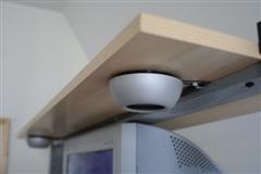


this is karma coming back at me for not paying attention in french class. so, monsieur christian if you're out there reading this, je suis désolé. and please translate the page for me. i remain votre petit étudiant, jules. link.

tags: , ,

work highs and lows - this height-adjustable jerker takes them on

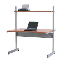
the ikea jerker is one popular work desk, if not the most popular. hey, it even has a shrine dedicated to revealing its all-consuming glory.


the original ikea jerker

but, favourite desk or not, it still may not meet your needs. to the tee. for instance, hans from sweden wanted a height adjustable jerker. now, that's an idea for ikea.

hans writes: "i've always wanted my ikea jerker computer desk to be height-adjustable. to make it easy for me to work standing or sitting down in front of my computer.

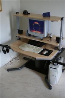
i bought a cheap adjustable desk from my office and lopped my ikea jerker legs off with a hacksaw. i then placed the jerker desk on top of the adjustable desk's legs (after i detached them from the desk). after that i took some wood screws and secured the jerker desk into the steel construction of the adjustable desk i bought."


jerker at low and high levels

best thing, it goes up and down at the push of a button. no manual cranking. is that cool or what? if you noticed, hans also attached 2 non spotlights under the top shelf to light up the desk for night time computing.


more than the desk, i was intriqued as to what he did with the "leftover" legs of the jerker table. then he let me in on his handy side table.


jerker with new adjustable legs
and side table from old jerker legs

"i took the 'leftovers' of the jerker legs, a piece of wood and some spike band and made a crossbar behind it. i re-used the side tables that should be on jerker and just put 'em at the sides of the legs. didn't do any calculation of the weight of the printers or any fancy math. i just took a chance. and it worked."

brilliant, hans!

more pictures of the jerker hack process here.
more pictures of finished height-adjustable jerker here.

other work desk hacks:
> have legs will combo
> vika wonderful

tags: , , ,

did someone hack the ikea catalogue?

okay, i digress again. but this is too funny.

ted tipped me off on this bit of news that has been circulating in canada and the internet.

it seems, if you flip to the first photo in the 2007 catalogue you'll see a photo of a young family lounging on a bed with a dog.


click to ... erm .. enlarge

"the dog, which appears to be a greyhound or whippet, seems to have one distinctly human male characteristic, prompting some to suggest the image had been tampered with by a mischievous employee using a program such as photoshop," reports ctv.ca.

according to ikea's canadian office, that's not the case. "the picture has definitely not been tampered with," debbie mcdowell, corporate communications manager for the swedish retailer's canadian office told ctv.ca.

she said the photo was shot in sweden, where the catalogues are put together. "we saw this particular photo when the prints came through here in canada. ... but we can definitely say this is a picture of a dog's leg, and it is not something else."

what do you think? the ultimate hack? :)

link

tags: ,

Check out this stream