Living with Art: Part Deux Update


I love it when people I've profiled email me or leave comments. They always add that missing element that makes the story so much more interesting. So I was very excited to receive the following comment regarding my profile of Marc Jacobs' Paris home that was featured in the November 2007 issue of W magazine. I hope you enjoy it too!

"I am the women in the sitting room photo. I'm Marc's personal chef. The photographer, Philip-Lorca DiCorcia decided he wanted me in one of the photos. Marc asked me if I wouldn't mind being in one of the photos with him while I was serving them all lunch on the terrace. It was an offer I couldn't refuse!! We just improvised...the make-up artist didn't even have 'women's make-up' because he thought he was only doing Marc. That's him, by the way(the make-up artist), under the covers, speaking of improvisation!!"

The Marc Jacobs story was a bit of a fantasy and not a regular home feature so it's even more fun to hear the behind the scenes shenanigans! I was also wondering who was under the covers and now the mystery has been solved!

a wine tower

paul turns the benno cd tower into a wine rack.

"i needed some kind of very narrow wine shelf that had to fit in between my book shelf and the loudspeakers. the power socket on the wall there has to be reachable, too.

after a while of pondering the possible constructions it came to me to just slightly modify a benno cd tower.

step 1
just build it as it is meant to be but leave out the back wall. don't worry, it's still quite stable (at least if connected to something else).

wine rack towerstep 2
mount the new wine shelf laterally to an existing object. i connected the shelf to the cupboard with those nifty connector screws by ikea. just ask nicely at their spare parts counter. but i've heard that you can get those connectors also at the hardware store.

tower wine racki wanted to get as many bottle spaces in the shelf as possible, preferably looking square, so i mounted the shelf boards with a 3 hole spacing - in my case i had still shelf boards left from another benno.

step 3
fill bottle spaces nicely with bottles - letting the necks stick through the back towards the wall. each space takes up to 2-3 bottles (depending on their diameter). if you like (and have enough booze), place one bottle decoratively standing on the top.

wine rack towerand you're done!

possible improvements: as the bottles tend to roll around when lying alone in their spaces, some kind of dimple in the shelf boards could help - or just stack'em to the brim!"

hacks at ikea philadelphia

kath spotted these hacks at ikea philadelphia! nice work, ikea.

"a while back, my husband and i were at ikea in philadelphia, and we saw a monitor stand made from a galant half-round table top and some 4" capita legs. before that we had only seen the galant half-rounds used as an end-cap for a galant table. we thought it was a great idea, since i still have an old monitor that's pretty heavy and needs that support, and so we bought the supplies and assembled it at home (pix below).

galant monitor standthis past weekend, we were back at ikea philadelphia and i guess since the galant half-round wouldn't match the alve desk, someone had the brilliant idea to make a monitor shelf made from what i believe to be an adel kitchen cabinet door (though it might have been a spare alve door they had around, i'm not quite sure which) and the capita legs (pix below). i'm not sure if this hack is a local hack or not, but i thought it was fun to see them use their own products in unconventional ways."

adel monitor stand

D.L. & Co. - Modern Alchemists and Purveyors of Curious Goods

There are creative types and then their are creative types that take things to a whole other level. Such is the case with Douglas Little, owner of D.L. & Co., which touts itself as Modern Alchemists and Purveyors of Curious Goods. That's putting it mildly. And what better time of year to profile Mr. Little and his fabulous company than at Halloween!

My first introduction to Douglas Little was through his original signature line of candles. They smelled like nothing I'd ever encountered before and had names that sounded slightly sinister like Thorn Apple, my favorite. I love it so much that I keep hoping he will turn it into a perfume. He already has a line of stationery and other objects and curiosities so I feel like it might be a possibility soon. Fingers crossed!

Last year, House and Garden featured Douglas Little's designs in a spooky spread in the November issue of the magazine entitled Gothic Splendor, and he also recreated the haunting images for the Fifth Avenue windows at Bergdorf Goodman. The following images are so stunning and visually intricate. I love them. You can also check out the Bergdorf windows and the process behind creating them on the D.L. & Co. website under Press.


Douglas Little's creativity and attention to detail continues to astound me. I feel like I never know what he's going to dream up next but I know it will be something fantastic, like the Mori Ex Cacao (Death by Chocolate) collection he collaborated on with Valerie Confections. The perfect Halloween treat to scare your sweet! BOO!

Chic Designer: Antonia Hutt

I realized recently that I haven't been focusing on interiors as much so I thought it was about time I profiled the home of one of my favorite interior designers, Antonia Hutt. Or at least what her L.A. home looked like in May 2001 House Beautiful magazine. I've held onto the tear sheets for years because I loved her use of color. It's funny that Antonia Hutt claims not to have a favorite color since her home is filled with orange and my home contains not much orange at all even though it is my favorite color.

It seems like nowadays, everyone has a Saarinen table and matching chairs but what really makes this set special is the blue leather cushions. I think the color is really beautiful against the white in her breakfast room. The Tommy Parzinger coffee set isn't too shabby either. And the "painting" is actually a rubbing of the tombstone of a medieval Scottish knight. How unique is that?!

I'm sure most people would never dare pair purple and orange but in the right tones, it's very complimentary. I also love how she placed the sofas back to back which actually make the columns part of the design instead of an inconvenience.

I love the painting Tangerine by Ray Richardson above the fireplace, one of the first Antonia Hutt ever bought, is a wonderful focal point and another use of orange.

The orange plastic on the 1960's dining room chairs is yet another pop of orange and compliments the blue banquette. The photograph of what first appears to be a tree in winter is actually a photograph of a building being demolished and is another unique piece of art in the home.

Antonia says the cream lacquered buffet by Tommy Parzinger reminds her of a Chanel handbag and is the perfect base for the 1970's aluminum lamps with orange shades. The tall mirror is a great vertical accent. If you notice, a lot of the art is tall and vertical and draws your eye upward. Even the shades in the bedroom below are another example.

I don't love the custom coral coverlet and shames on the bed. It's just not my style but other than that, I could move in tomorrow and be very happy. And that's my idea of great design. And what could be better than an orange filled home right before Halloween?!

Photos by John Coolidge

create a ceiling sculpture

diwa previously won kudos for his good looking laundry hamper, even a nod from la apartmenttherapy. he does it again with this ceiling sculpture.

"it started when i bought an extra ivar brace frame by mistake. i was looking at it and thinking, 'i am sure i can do something fun with this'. i was intrigued by the idea of hanging it from a ceiling. my idea was to make a light fixture out of it, but i never really integrated any lights into it. i do plan to add small LEDs between the plexi panels someday, but for now, it remains a sculptural ceiling fixture.

plexiglas ceiling sculptureplexiglas ceiling sculptureplexiglas ceiling sculptureplexiglas ceiling sculpturesome hand-cut 1/4 inch plexiglass, steel cable, fishing line, tension springs and the versatile ivar brace was all i used and yes, a threaded rod and nuts to hold the plexi in place."

Habitually Chic Jewelry: Asha by ADM


"A thing of beauty is a joy forever" - John Keats


Every woman should have at least one signature thing that reminds people of her. For me, it's my perfume and my necklaces. I can almost always be found wearing a long beautiful necklace and one of my favorites is by Asha by ADM. Asha's story is almost of fun as her designs too.

Ashley Dodgen-McCormick designs under the name Asha, a nickname given to her by her Cuban grandparent's, and is only 24 years old! Having lived and studied in New York, Paris and Florence, her jewelry reflects a love for art, travel and a cosmopolitan lifestyle. As an art history major at Georgetown University and inspired by the world of aesthetics, Ashley launched her jewelry line to create classic pieces with a fresh appeal.
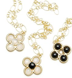
Ashley incorporates semi-precious stones, natural materials such as shell and ivory, and sterling silver dipped in 18k yellow and white gold with a discerning eye for art and history. Her signature quatrefoil clasp was inspired by frequent visits to the medieval chapel, Ste. Chapelle, in Paris, where she studied at the Sorbonne as well as pre-roman architecture she studied in Italy. Many of her designs are interpretations of architectural motifs and also of vintage pieces found in New York and travels abroad.

You really have to check out the rest of her collection online because these photos don't even do it justice. Her pieces are at the same time modern and classic. I love her mother of pearl necklaces that remind me a little bit of Van Cleef and Arpels but aren't a knock-off. Calypso in New York carries an extensive selection of her designs including the famous Zodiac rings which look similar to the Zodiac necklace above. She just previewed her Spring 2008 jewelry line this week and has added jeweled clutches to her repertoire. I can't wait to check them out because evening clutches are another weakness of mine!

skinny shoe storage that holds 36 pairs

dana was tight on space and found a slim solution for off-season shoe storage. most of all, i like how she painted the shoe boxes to blend with the colour scheme on the facing wall.

dana used small screws to fasten 4 units of trones shoe boxes together from the side. the fronts are painted with rustoleum's standard blue, green and light gray spray paint. the tops and exposed side are finished with rustoleum's aluminum paint to blend with the frame of the wall.

view more of dana's slim shoe storage.

Chic Designs: Sophie Conran for Portmeirion


One of the first things I put on my Christmas list this year is Sophie Conran's Collection for Portmeirion. I already own a few pieces including the sugar bowl and creamer that sit on my stove (see last photo) but now I want the place settings. Actually, I want the whole darn collection. Every last piece! But only in pale robin's egg blue. It's my favorite color and matches my decor perfectly. I love that they all look slightly off kilter and handmade, although I'm sure they are not but it's nice to know something mass produced doesn't have to look like it!

Sophie Conran is the daughter of Sir Terence Conran, the famous designer, and is a cookbook author as well as designer now herself. She said she believes in enjoying every moment and in creating a beautiful world around you and your family, with warmth, simplicity and love.

The Portmeirion Collection includes the porcelain which has been designed to look as good on the dining table as it does in the kitchen. They not only look great but are robust and can go from the worktop to the oven to the table to the freezer, and back to the oven again. Love it! There is also glassware, silver serving pieces, wood pieces, and aprons and tea towels. Oh, and it's also a design winner! Sophie's collection won the Elle Decoration Design Award in 2006. So I guess I'm not the only one who appreciates it. There are many stockists who carry the collection including Anthropologie, Macy's and Amazon.com. Just in case you want to put in on your holiday wish list as well.


it's a wrap for the oddvar

simon has a small ikea hack, as he terms it, to share with us.

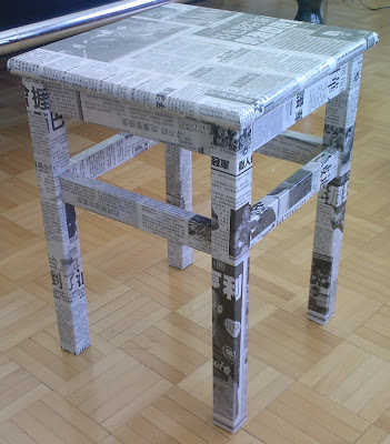
oddvar stool"last month, we bought an oddvar chair (can't find the link on ikea's website). to improve the look, we bought an asian newspaper and wrapped it around the pieces of the chair using paste before assembling it. finally, we used 'thick' varnish to protect the newspaper and make the chair washable."

Habitually Chic Artist: Julian Barrow

Bethesda Fountain, Central Park, New York


I'm always in awe of artists who are capable of evoking the feeling of a particular place through their art, especially those old-school artists such as Julian Barrow. When the invitation for his upcoming exhibition at W.M. Brady & Co. in New York crossed my desk, I thought his art was just too spectacular not to share.

Julian Barrow, a painter of cityscapes, conversation pieces and interiors throughout the world, is an Englishman as comfortable in New York, Venice, and Rome as he is in London. His paintings convey his delight in travel and in getting to know a subject, whether it be architectural, human or a combination of both. He has exhibited regularly in New York, London and the Middle East since the 1960's after studying painting in Florence. His studio is in Tite Street, Chelsea, London in a Victorian building of studios where both Sargent and Whistler painted. And as you can see from his work, he is just as wonderful and talented as the former tenants!

After I uploaded my Julian Barrow post yesterday, I received a lovely email from Mary Aarons, Slim Arrons' daughter, mentioning that she had met Julian Barrow and admired his painting in person when she met him this past April at the Palatino (overlooking the Forum and Colliseum in Rome). How exciting is that?! She was even kind enough to send me the photo above. The best part about blogging is hearing fun stories like this that add another wonderful dimention to a story.

Park Avenue at 69th Street, New York

Dogana, Venice

Palazzi on the Grand Canal, Venice

St. Peter's, Rome

Horse Guards, London

pax wardrobes to organise your entire office

some years ago, i remember ikea having home office fittings for the pax wardrobe system. i was so tempted to buy it because i could just close the doors and the office, together with all my mess would disappear. but finally, the thought of working out of a closet was just too claustrophobic for me. nonetheless it is good see that jen has made the pax wardroble office work. [via apartmenttherapy home tech, thanks anna!]

2 pax wardrobes with drammen doors hold jen's entire office. i would suggest a pax pull out shelf (with a wooden shelf placed in it for thickness) for the laptop and to avoid having to work with the cabinet under her feet.

compact home officehome office furnitureclick to see jen's home office on apartmenttherapy.

Kate Moss Holiday Collection for Top Shop

One of my favorite things to do when I go to London is to visit Top Shop. If you've ever been there, you'll know why. It's the most fabulous store, chock full of spot on trends at inexpensive prices and amazing vintage clothes as well. There are rumblings about a store opening up in New York but no confirmed report as of yet. Too bad since Kate Moss has just unveiled her new holiday collection.

Barney's had a small selection from her first collection that sold out in about 30 seconds so I'll keep my fingers crossed that they get the holiday clothes. They're a little seventies disco era looking but also completely modern with a little Deco thrown in for good measure. If Barney's doesn't carry them, I might have to hop across the pond for a little shopping!

Love in the Time of Cholera

I buy a lot of books that I start but get too busy to finish, such was the case with Love in the Time of Cholera. But now, I am determined to finish it before the movie version comes out on November 16th! It looks so beautiful! I can't wait to see it!

The movie is based on the acclaimed book by the Nobel Prize-winning author Gabriel Garcia Marquez and tells the epic love story of a man who waits fifty years for the love of his life amid the lush, romantic backdrop of early 20th century South America.

It was adapted for the screen by Academy Award winner Ronald Harwood (‘The Pianist’) and directed by Mike Newell (‘Harry Potter and the Goblet of Fire’). It stars Academy-award nominated Javier Bardem, Giovanna Mezzogiorno, and Benjamin Bratt. Colombian-born, international recording artist Shakira has even contributed songs for the movie and soundtrack. If this talented group of people can't put together an amazing movie, I don't know who can! But don't forget to start with the book!

Check out this stream