 Topshop finally opens this week in Soho and if that wasn't enough to cause a stampede, the Kate Moss Collection for Spring 2009 debuts the same day! Maybe I'll wait until Saturday to check it out. Cheerio!
Hail Brittania!
 Topshop finally opens this week in Soho and if that wasn't enough to cause a stampede, the Kate Moss Collection for Spring 2009 debuts the same day! Maybe I'll wait until Saturday to check it out. Cheerio!
A compact Mackis charging station
Hayley turns the Mackis stationery caddy into into a charging station. I like the cork pad for the gadgets to rest on. Nice touch.


Labels:
accessories
Island Life
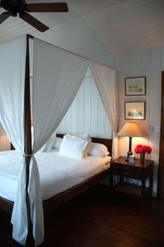
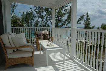
 I need a vacation. And if I had known earlier that you could rent out The Guest House and Cricket Pavilion on India Hick's propoerty Hibiscus Hill on Harbour Island, I would have thought about planning a trip sooner. They both look heavenly. Instead I will make do by drooling over all the photos in her book, Island Life, and wishing I was there. Sigh.
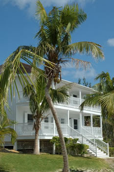
Photos from Domino, Cookie, Island Life and Hibiscus Hill website
Labels:
Beach House,
india hicks,
island life
OMG!!!! (Squealing like a 13-year-old girl!)
THEY. ARE. COMING.

Finally the day has arrived!
Yes, I squealed. Blew out my hubby's eardrums.
My girlfriends and I are already planning how we are going to purchase the front row seats.
Who do we know? Who can we bribe? Who can we steal borrow from?
We will get them. Oh yes, we will.
OK. Done. Back to our scheduled programming. Check out my five dollar projects below.
Squeal!
UPDATE: Tickets are secured by a very-powerful-distant-cousin-of-best-friend-and-coworker-of-my-sister person.
We don't know where we will be sitting but this guy has connections around here I am confident he will hook us up!!
Awww yeah!!
Double squeal!
Labels:
love
Scrabble Table
Another table to start off our week. This one I like, being a Scrabble fan. Jodie was about to get rid of this old $10 Ikea Lack table but decided it could be salvaged. And here it is.

She says, "I decided to experiment with it instead. I am a huge Scrabble fan, so I painted a functional scrabble board in the same color scheme as my den. I measured out and drew squares, then glued over the grid lines using Elmer's gel glue. I then spray painted the table, peeled the dried glue off, and used craft paint to fill in the colored squares."

She says, "I decided to experiment with it instead. I am a huge Scrabble fan, so I painted a functional scrabble board in the same color scheme as my den. I measured out and drew squares, then glued over the grid lines using Elmer's gel glue. I then spray painted the table, peeled the dried glue off, and used craft paint to fill in the colored squares."
Labels:
furniture
A happy bedside table
Alicia gives her Rian bedside table a happy new look.
She says, "It's not really a difficult hack, but I covered my Rian table with fabric.
All I did was to detach the tabletop with a screwdriver. Lay the top side down on fabric and attach with a staple gun, pulling the fabric tightly. Screw the top back on, and voila."

See more of Alicia's Rian bedside table.
She says, "It's not really a difficult hack, but I covered my Rian table with fabric.
All I did was to detach the tabletop with a screwdriver. Lay the top side down on fabric and attach with a staple gun, pulling the fabric tightly. Screw the top back on, and voila."

See more of Alicia's Rian bedside table.
Labels:
furniture
Five dollar Spring projects!
Hope your weekend was GREAT! It snowed here today. Ugh. So it was fitting that I worked on Spring projects, eh?
I'm joining Lindsay over at Living with Lindsay for her Five Dollar Challenge -- check out her site, so much fun!
 Money doesn't grow on trees?? No one sent me that memo. I should clarify -- one of these projects was FREE and one was only two bucks.
Just sayin'.
Let's start with one of the cutie moss bunnies at Pier One. I've picked these up about four times in the past month or so, but couldn't figure out what to do with them. Last week, it hit me:
 A pot I already had, along with foam and moss I already had. Add in a $2 mossy bunny:
 ACK! Adorable! Stuff the foam in, stuff the moss on top, stuff in the bunny. You are DONE.
My other project was one I'm really excited about -- because I know you already have half of it in your cabinet:

I used my jute twine (correction from this post -- I thought it was sisal but turns out jute has a slightly darker look that I like better than the sisal) and wrapped it around and glued it like I did the bottles. I. love. it. It screams Spring to me. I threw in the "faux" flowers till I splurge on some white tulips. (When did tulips get so expensive??):
 And I have to show my under $5 projects from last week as well -- you can find them here. My son's art caddy:
 Little container for little toys:
 Four custom tags for under $2:
 Fun little magnets:
 Head over to Lindsay's to see more fun projects! And keep linking up your spray painting projects here -- so much inspiration!
I'm joining Lindsay over at Living with Lindsay for her Five Dollar Challenge -- check out her site, so much fun!
 Money doesn't grow on trees?? No one sent me that memo. I should clarify -- one of these projects was FREE and one was only two bucks.
 Just sayin'.
Let's start with one of the cutie moss bunnies at Pier One. I've picked these up about four times in the past month or so, but couldn't figure out what to do with them. Last week, it hit me:
 A pot I already had, along with foam and moss I already had. Add in a $2 mossy bunny:
 ACK! Adorable! Stuff the foam in, stuff the moss on top, stuff in the bunny. You are DONE.
My other project was one I'm really excited about -- because I know you already have half of it in your cabinet:

If you are the ONE person on earth who does not have the generic glass vase that comes with all flowers, then just get your booty over to Goodwill -- they've got about 25 waiting for you.
I used my jute twine (correction from this post -- I thought it was sisal but turns out jute has a slightly darker look that I like better than the sisal) and wrapped it around and glued it like I did the bottles.
 I. love. it. It screams Spring to me. I threw in the "faux" flowers till I splurge on some white tulips. (When did tulips get so expensive??):
 And I have to show my under $5 projects from last week as well -- you can find them here. My son's art caddy:
 Little container for little toys:
 Four custom tags for under $2:
 Fun little magnets:
 Head over to Lindsay's to see more fun projects! And keep linking up your spray painting projects here -- so much inspiration!
Dining by Design 2009
For those who don't know, DIFFA stands for Design Industries Foundation Fighting AIDS and each year in different cities, designers and sponsors get together to create amazing dining tables for a Gala Dinner to benefit DIFFA. It is an event full of creativity, thoughtfulness and fun with designers coming out to support other designers.
 I went to the event to support my friend, interior designer Brad Ford who designed the most talked about table at the event! His theme "Change is Good" was conceived with the notion that everyone has spare change in their pocket that they could contribute to support DIFFA, hence the piggy banks!
 Another favorite table was part of the Student Design Initiative and created by New York University, Tisch School of the Arts Department of Drama. They were advised by interior designer Miles Redd who I met for the first time at the party and who couldn't have been nicer. Under his wonderful tutelage, the students created a wonderfully fun pixelated room.
 Another fun and colorful table was designed by the students from Parsons who were advised by interior designer Vicente Wolfe.
 One of the first tables you saw when entering the venue was by Tracy Stern. It was a riot of color and tea sets since Tracy has a line of teas and is opening SalonTea Bar on the Upper East Side.
 It was fun checking out all the different china patterns!
 Italian winery and DIFFA sponsor, Castello di Gabbiano had a beautiful Tuscan table that was designed by Marc Blackwell who also designed the china. My favorite part of the table were the side panels that looked to be plexiglass and were printed with sepia tones scenes of Italy and the vineyard. They were hard to photograph at the evening event which was a shame.
Labels:
brad ford,
DIFFA,
dining by design 2009,
michael tavano
Subscribe to:
Comments (Atom)
Check out this stream
Blog Archive
-
▼
2009
(952)
-
▼
March
(73)
- Hail Brittania!
- A compact Mackis charging station
- Island Life
- OMG!!!! (Squealing like a 13-year-old girl!)
- Scrabble Table
- A happy bedside table
- Five dollar Spring projects!
- Dining by Design 2009
- Off To The Big Easy!
- Baseball card collage table
- Malm bed goes glam
- Spring Magic at the Mansion
- How to install a dimmer switch.
- Customised bay window desk
- Grain Sack Pillow Giveaway!!!!
- Meeting Mr. Hadley
- Gorm and the wash basin
- Four ca-ute projects under $5!
- Benjamille Chair
- Home is where the start is...
- Suzanne Kasler: Inspired Interiors
- Handsome makeover for ugly AC unit
- You know what Spring means!!
- Chic Château Boucéel
- Happy Spring!
- My most favorite room.
- Billy bookcases as room dividers
- All in a Day's Work
- The Romance Of Italy - Rimini's Grand Hotel
- Head cushions for the sofa
- Photo Shoot Fun
- My priorities are whacked.
- Broder-Lack Freestanding Shelving
- Going Gray
- Multi-tiered charging station
- Perfect Paris Penthouse
- How I stencil
- Dual personalities: LEGO table on one side, work s...
- Historic Racing Club
- Valentino: The Last Emperor
- Giveaways, Contests and Facebook! (OH MY!)
- Creating a DVD wall with lighting
- Another Billy pantry
- Industrial Kitchen Stools For All Styles
- Thad Hayes: The Tailored Interior
- Designer to Watch: Courtney Giles
- Using Ballard Designs as inspiration
- Flaren stealth cat litter box
- "Peep"-ing at Orange
- 2009 Kips Bay Decorator Showhouse Designer: Willia...
- Need kitchen space? Get a cart
- How to deal with soaring ceilings
- Flea Market Finds
- Bowling alley chair hack
- Stephen Sills Associates
- All about molding!
- French Country Living in Normandy
- Billy finds new purpose as a pantry
- A trim Lack stereo shelf
- Oh Baby!
- Gratuitous Cute Boy Post
- Don't be afraid!
- Loft and bedroom with kickass desks
- Style Star Lili Diallo
- Customised bulletin board
- Art in Design
- Art Smart: March Ugallery Picks
- Plenty from Lack
- Little bit of Spring!
- Designer to Watch: Katie Fine
- Kips Bay Decorator Showhouse 2009 Update
- Swedish Style Country Homes
- Spring Ahead
-
▼
March
(73)


